Goals
- Prepared Approach Document & SOW Document to establish a clear project roadmap.
- Conducted thorough requirement gathering during development.
- Implemented new technologies, including Vue.js, Gulp, and REST API, to enhance performance and user experience.
- Developed batch processing for efficient content import.
- We have implemented queue-based processing for streamlined order management.
- Established ticket milestones for effective project tracking.
- Addressed compatibility issues of contributed modules for Drupal 9.
Key Features
- Dynamic Map with Customization: Users can customize their view and access information about the team and projects.
- Dealer Search and Listing: Conveniently search for authorized dealers and view detailed listings with directions and mileage calculations.
- Cron-based Order Import and Dynamic Invoice Generation: Orders are imported automatically from the server, generating dynamic invoices.
- Product Slider Hot-Spot Visual Editor: A visually appealing product slider allows users to interact with hot spots for detailed product information.
- Product Comparison and Filters: Users can compare products and apply filters based on specifications.
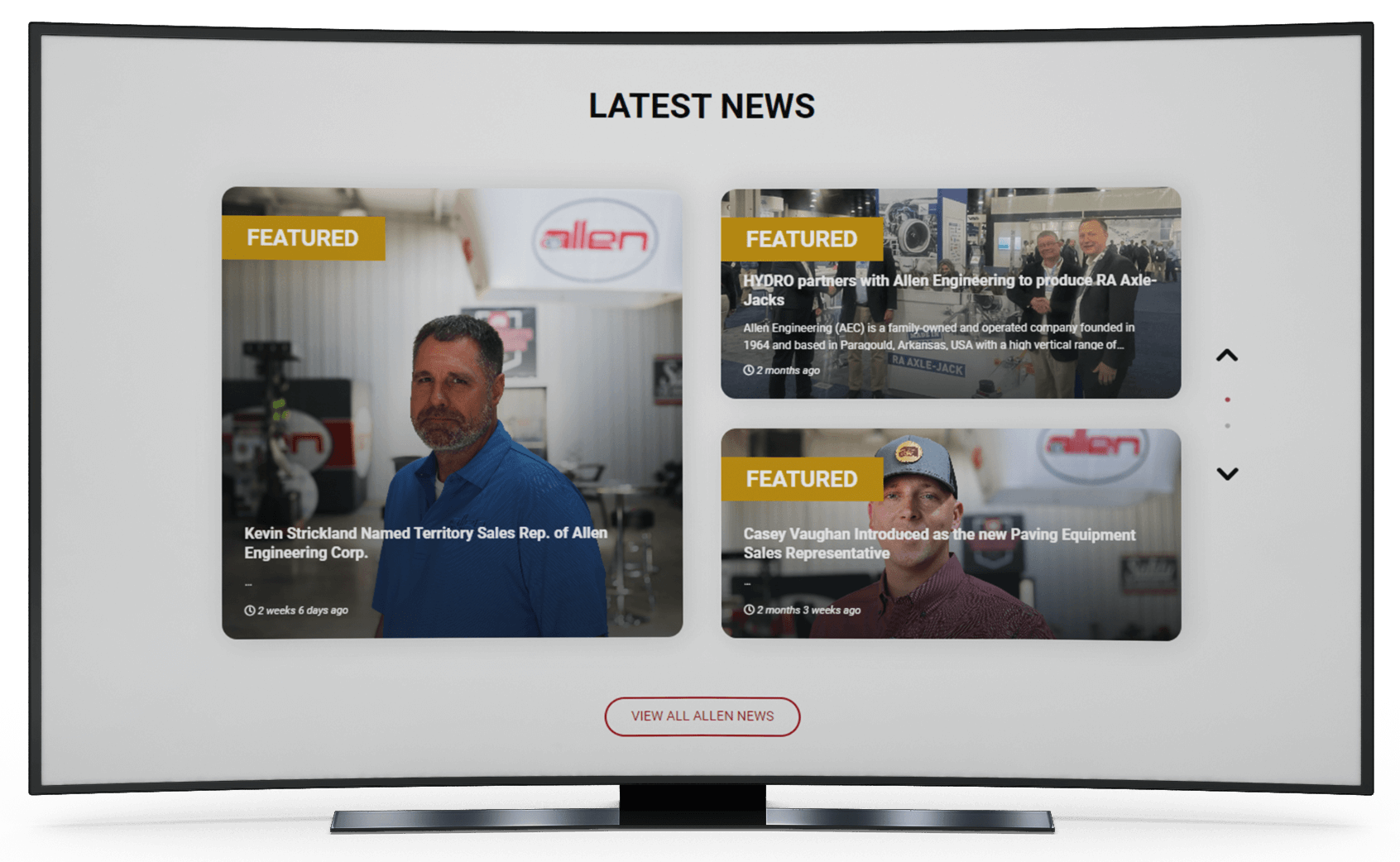
- News Categorization with REST API: News content is categorized using REST API and seamlessly displayed on the website.
Technologies Used
The website was developed using the following technologies:

Vue.js
A progressive JavaScript framework for building dynamic user interfaces.
Gulp
A task runner for automating repetitive development tasks.

REST API
Used to integrate external systems and services for seamless data exchange.

Drupal 9
A robust content management system serving as the foundation for the website.

Design
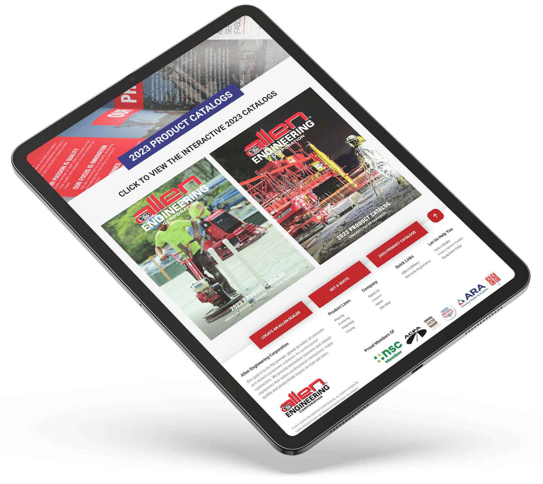
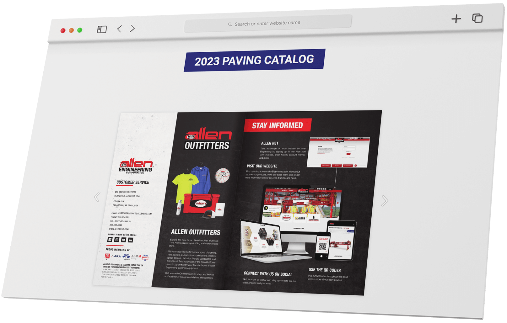
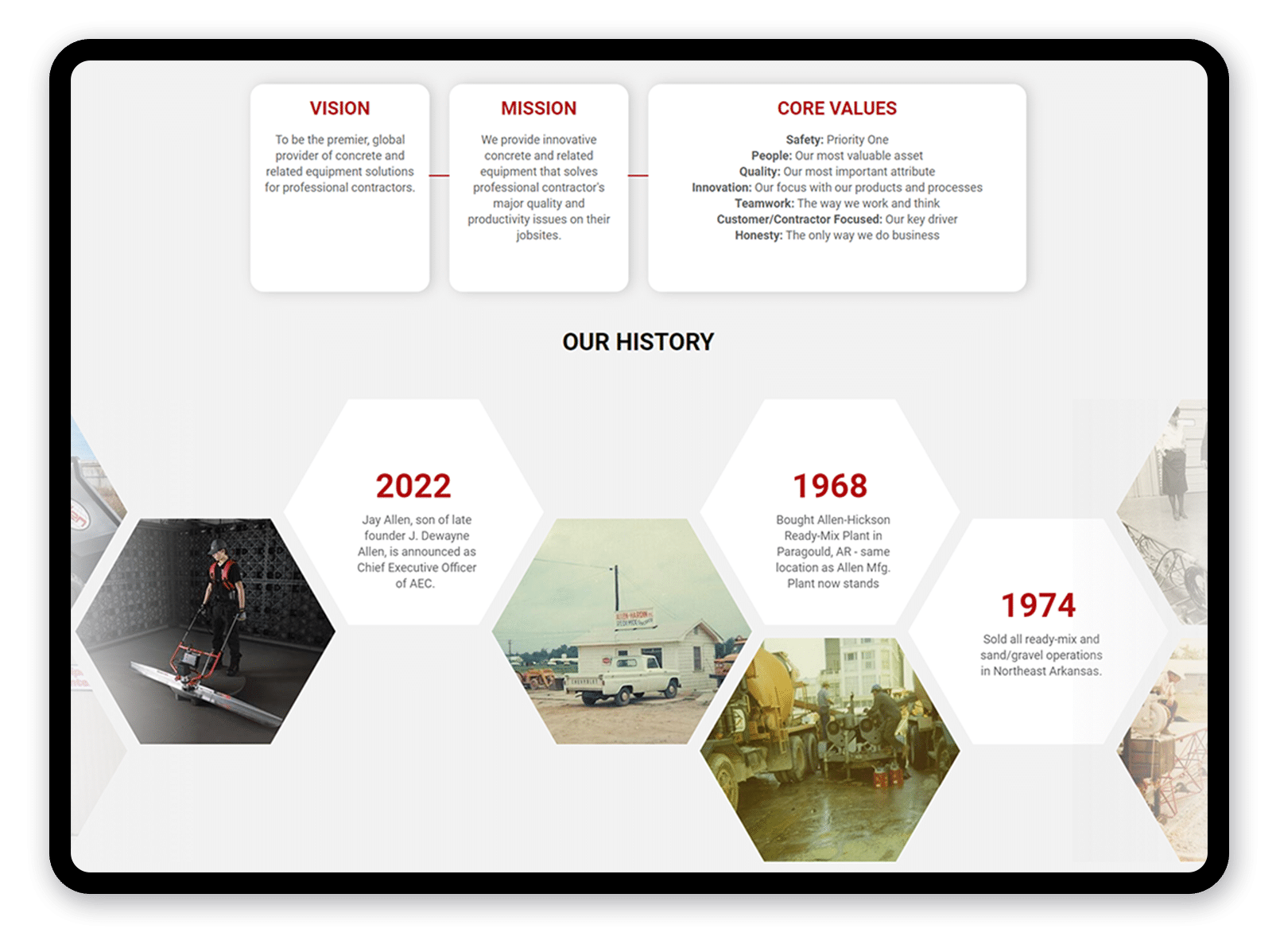
The website features a modern and professional design that reflects the company’s expertise. With a clean and intuitive user interface, visitors can easily navigate and access relevant information. The color scheme and typography align with the brand identity, creating a cohesive and visually appealing experience.
Responsiveness
The website is fully responsive, ensuring optimal viewing across devices. Whether accessed from desktops, tablets, or mobile phones, the design and layout adapt seamlessly to different screen sizes, providing a consistent user experience.


